
Competition Awardees
The Competition Sponsors received 607 Submissions from 58+ countries, and 17,000+ public votes. The seven-member Competition Panel, along with the public vote, selected the following Competition Awardees. The Department of City Planning Director Marisa Lago chose the new official New York City POPS logo among the Awardees.
The Department of City Planning
Director's Choice for the Official POPS Logo!
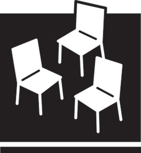
#572, "Have a Seat"
Submitted by Emma Reed
I am a graduate of Syracuse University and grew up in central New Jersey. I have been working as a graphic designer in NYC for the last four years in both freelance and staff positions.
Logo Statement:
This image welcomes an individual or several people to sit down in a specified space. While the space is static and given dimension and a sense of weight by the use of the horizontal bar along the bottom, the arrangement of the chairs is freeform and open to the whimsy of its user.
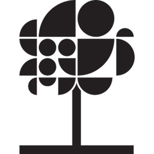
#607, "More Than a Tree"
Submitted by Gensler NYC Brand Design Studio
Gensler’s New York City Brand Design studio is a collaborative team of designers, strategists, and storytellers that engages with a wide variety of clients on projects of all sizes—from product packaging and websites to campus signage systems and international brand positioning.
We believe the beacon of your brand is your identity, it must be both memorable and engaging.
As Gensler brand designers, our approach combines design and architectural expertise with a unique point of view and strong communication skills. We believe that this approach results in brands that build trust, inspire confidence, and forge lasting relationships.
Logo Statement:
POPS are everywhere, hidden oases in an urban forest of glass, steel, and concrete. They come in all shapes and sizes, forming a network of treasured public spaces - spaces in which all can relax, eat, socialize, and explore.
In the same way, our logo unites active and diverse shapes into one recognizable symbol. The tree makes a single statement, but close-up one can see the network of parts that form the whole.
POPS are part of a city in constant motion. Our design captures this energy by encouraging the eye to move across a dynamic, playful composition. The rounded shapes feel friendly and approachable but are grounded in the structure of an implied “city” grid. In this way, it recognizes the iconic original logo. However, by unlocking it from the original bounding box we make it feel accessible and welcoming.

#507, "Constellation"
Submitted by John Schettino
John Schettino is a designer and artist whose work concentrates on space, place and mobility. His design practice helps people to engage with and negotiate the physical environment through projects that address wayfinding and placemaking needs. John is a Fellow with The Design Trust for Public Space where he has been the graphic design lead on the project “Future Culture: Connecting Staten Island’s Waterfront” an initiative to develop cultural strategies and pilot projects to promote equitable neighborhood development. As a member of the AIA NY Transportation + Infrastructure John has been an advocate for social, cultural and civic mobility and has organized public discussions on these topics including a current series of public programs at Center for Architecture under the overall subject “Locating Power in Mobility”. The most recent program in this series is “Mobility + Social Agency: Embedding Equity in Mobile Systems”.
To learn more: http://johnschettinodesign.com/
Logo Statement:
New York’s constellation of Privately Owned Public Spaces constitute a distributed commons; a city-wide array of shared space. Through peoples everyday use – resting, reflecting, playing, convening – these spaces are invested with meaning and transfomed from abstract space into active public places.
This logo represents NYC POPS as a commons inscribed with activation and intersection, scaling from individual locations to an overall array of 500+ POPS.
Notable Mentions
The Panel, along with the public vote, also selected the following Submissions as notable mentions:
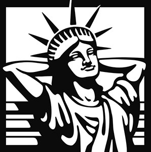
#624, "The Statue Of Liberty Having A Break"
Submitted by Derek Pommer
My name is Derek Pommer, I am a Canadian-born graphic artist and illustrator based in Muenster, Germany. After having studied Graphic Design/Visual Communication in Germany, I started out working exclusively in advertising. Over the years I gradually feeled the desire to work more artistic which is why I additionally specialized on illustration. Since the first part of my childhood took place in Canada before I moved to a different continent, I always kept up my roots. Probably this is why I like to think and work globally, internationally. This competition appears to be a chance to do so.
Logo Statement:
In my design for a new POPS-logo, I chose to illustrate the Statue Of Liberty in a slightly unusual, relaxed pose. Apart from the Empire State Building, this is the symbol par excellence for New York City and is internationally well-understood by residents and tourists. In my opinion, this is a likeable image of the famous icon with a bit of humorous content: Lady Liberty has simply put aside her torch and tablet to have a break on an indicated park bench, and she does this with a whiff of a smile. As a personification of this metropole, she serves as a guide to those in search of a recreation possibility.
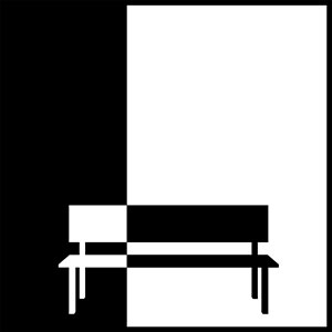
#479, "POPS Nolli"
Submitted by Ryan Crooks
Ryan Crooks is an architect and professor in Atlanta, Georgia.
Logo Statement:
The POPS Nolli logo shows a representation of a bench within a square with contrasting fields of black and white that create figure ground relationships similar to those in Giambattista Nolli’s 1748 Plan of Rome engravings, where the private structures are represented as solid black and the public spaces, including piazzas, cortiles, and religious structure interiors, are shown without color or hatching, simply defined by the black of the surrounding private structures. The logo’s white field is in the Golden ratio, providing visual dominance to that of the public realm, while the black of the private defines the square and bounds the white field, showing that the public space is within the private domain. The implied white square in the logo’s upper right provides visual interest but can be considered a play on the traditional square or common, where citizens have met and interacted over hundreds of years.